Written for Shields Flowers & Events by DapraLab
Introduction: Color Makes the Moment
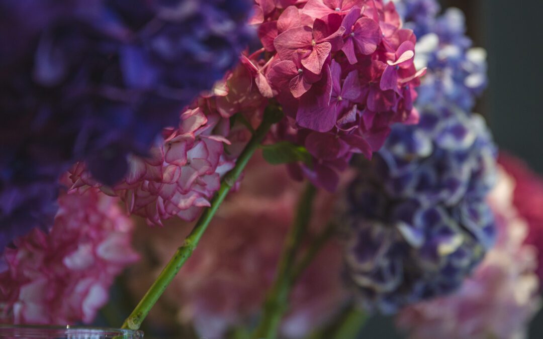
For most of the past decade, pastel palettes—blush, ivory, dusty sage—dominated New York’s luxury events. They were timeless, photogenic, and safe. Then came 2025, and suddenly safe felt…predictable. Couples, brands, and gala committees now want florals that radiate personality: vivid magentas, emerald greens, electric cobalt, juicy tangerine, saffron yellow. At Shields Flowers & Events, we call this shift “beyond blush”—the move from whisper‑soft hues to saturated statements that flood a room with energy and make guests reach for their cameras before they’ve even found the bar.
Why Bold Is the New Beautiful
1. Self‑Expression Over Tradition
Today’s clients see color as an extension of their story. A bride who loves fashion might pair fuchsia peonies with coral orchids; a tech brand might unveil its new logo in a sapphire‑and‑citrine floral lounge. Bold palettes become a signature, not background noise.
2. Social‑Media Impact
Deep, saturated tones photograph brilliantly—no filters required. Jewel‑toned blooms pop against city skylines, turning every centerpiece into ready‑made content for guests’ feeds.
3. Expanded Floral Supply
Growers now offer roses in mustard, carnations in denim blue, tulips in near‑black. With a broader pigment palette at our fingertips, designers can layer hues in ways impossible a few years ago.
4. Emotional Resonance
Color psychology matters: vibrant reds and oranges spark excitement, blues and greens soothe, purples evoke luxury. Used intentionally, bold florals guide the mood of an evening.
Creating Cohesive Bold Palettes
Color Blocking
Rather than mixing ten vivid shades in one vase, we group blooms by hue—an arrangement of all‑turquoise hydrangea beside one of all‑chartreuse orchids, for example. The eye reads structure and sophistication, not chaos.
Analogous & Complementary Pairings
Select one dominant hue (say, deep berry) and accent with neighbors on the color wheel (plum, crimson) or its direct complement (chartreuse). Both approaches create harmony while keeping saturation high.
Texture as a Neutral
Velvety roses, matte anthuriums, feather‑light pampas: mixing textures prevents a bold palette from feeling flat. Texture acts like punctuation in a bright sentence.
How Shields Uses Bold Color—Real‑World Examples
The “Prismatic Loft” Wedding
Venue: Industrial SoHo space with white‑brick walls.
Palette: Fuchsia, tangerine, marigold.
Design Details:
- Color‑blocked runner of mono‑hued compotes marching down communal tables.
- Ombré ceremony arch that faded from soft peach at guests’ entrance to saturated raspberry at the vows.
Why It Worked: White architecture became a gallery backdrop, while the progressive palette mirrored sunrise to sunset—symbolic storytelling guests immediately grasped.
The “Jewel‑Box” Corporate Gala
Client: Luxury watchmaker unveiling a sapphire‑crystal timepiece.
Palette: Sapphire, ruby, emerald, amethyst.
Design Details:
- Four lounge zones, each drenched in one jewel tone—florals, candles, velvet cushions.
- Black mirrored coffee tables to amplify color reflections.
Why It Worked: Guests navigated a sensory journey through branded hues; every corner looked like a high‑fashion editorial shoot.
Design Techniques for Maximum Impact
| Challenge | Shields Solution |
| Windy rooftop or outdoor venue | Use low, wide vessels and weight them with acrylic “water bricks” so even heavy jewel‑tone arrangements stay put. |
| Ballroom with colored uplighting | Pin‑spot centerpieces in a complementary brighter shade to prevent them disappearing into a wash of light. |
| Mixed guest tables (round + long) | Alternate mono‑hued low bowls on rounds with elongated color‑blocked runners on longs—balance height and palette simultaneously. |
| Desire for late‑night “palette shift” | Swap dinner candles for tinted LED pillars; jewel‑tone florals now glow in a new light without changing a single bloom. |
Sustainability Without Sacrifice
Going bold doesn’t mean going wasteful. Shields still designs foam‑free, using reusable chicken‑wire domes and water‑filled acrylic grids. We source locally‑grown specialty dahlias and ranunculus in extreme hues during peak season, lowering transport emissions while keeping pigment saturation high. After events, intact florals are donated to local hospitals, where bold colors uplift patient spirits just as powerfully.
DIY Corner: 5‑Stem Jewel‑Tone Table Accent
- Choose a single hue (e.g., cobalt blue).
- Gather one hydrangea, one delphinium stem, one thistle, and two cornflower stems.
- Trim to varied heights and cluster in a short ceramic bowl.
- Add a mirrored coaster beneath to double the color impact.
- Finish with a single gold taper candle beside the arrangement for high‑low contrast.
This mini‑design proves color blocking can be dramatic even on a coffee‑table scale.
Ready to Go Beyond Blush?
A fearless palette signals confidence, creativity, and celebration. Whether you’re envisioning a sapphire‑lit ballroom gala or a fuchsia‑and‑citrus summer wedding, Shields Flowers & Events will translate your color dreams into floral artistry that feels lavish, modern, and unmistakably you.
Call us at (212) 555‑1935 or book a private consultation to start designing your own bold‑color masterpiece. We’ll ensure every bloom shines—no filter required.